Workflows
- Cross Validation for Survival Models
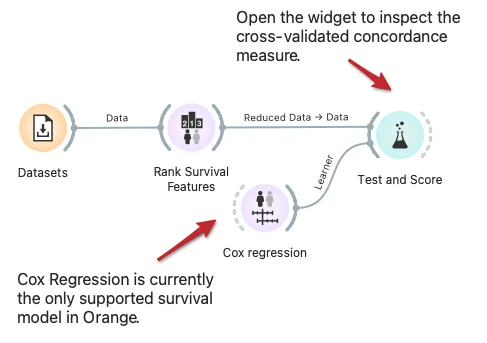
Orange built-in methods for testing and scoring the predictive models now support survival-related models like Cox regression. Here we demonstrate cross-validation to estimate the concordance index for the Cox regression model trained on data instances from selected features.
Download - Cluster Inspection
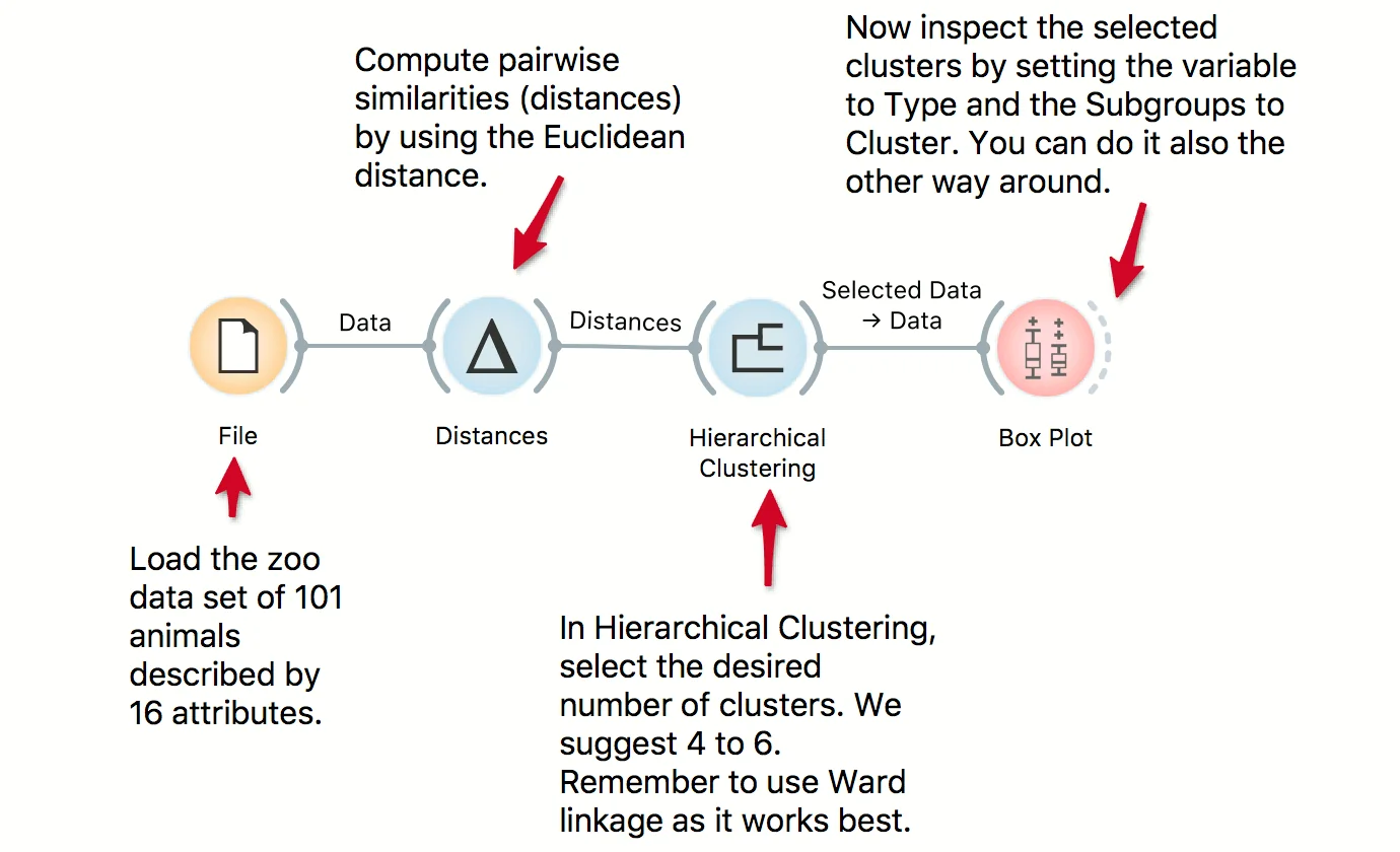
We use the zoo data set in combination with Hierarchical Clustering to discover groups of animals. Now that we have the clusters we want to find out what is significant for each cluster! Pass the clusters to Box Plot and use 'Order by relevance' to discover what defines a cluster. Seems like they are well-separated by the type, even though the clustering was unaware of the class label!
Download - Cohort Construction and Validation
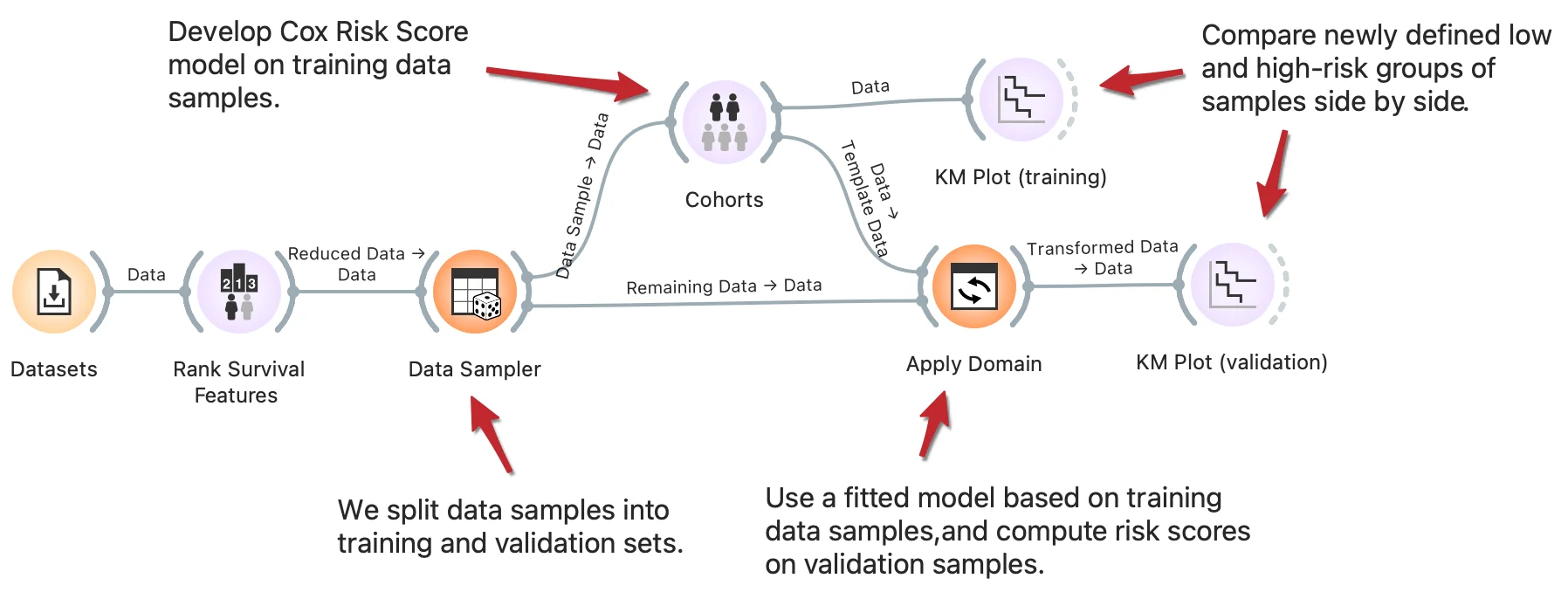
Stratification of patients into low and high-risk groups is a common task in survival analysis to identify clinical and biological factors that contribute to survival. One approach to stratification is by computing risk score values based on the Cox regression model. With the clever use of Orange widgets, we can split the data into training and validation sets and then interactively generate risk score models on training data to observe the difference in cohorts' survival rate on training and validation samples side-by-side. Read more on how Apply domain enables this kind of workflows.
Download - Cross Validation
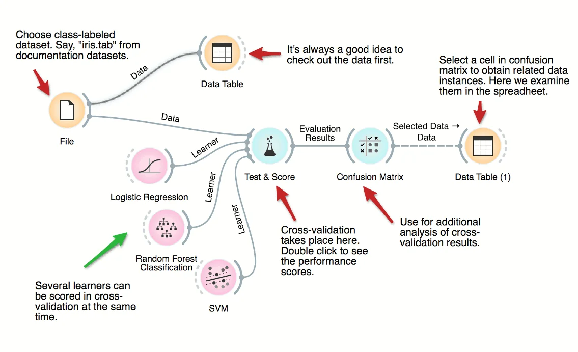
How good are supervised data mining methods on your classification dataset? Here's a workflow that scores various classification techniques on a dataset from medicine. The central widget here is the one for testing and scoring, which is given the data and a set of learners, does cross-validation and scores predictive accuracy, and outputs the scores for further examination.
Download - Train and Test Data
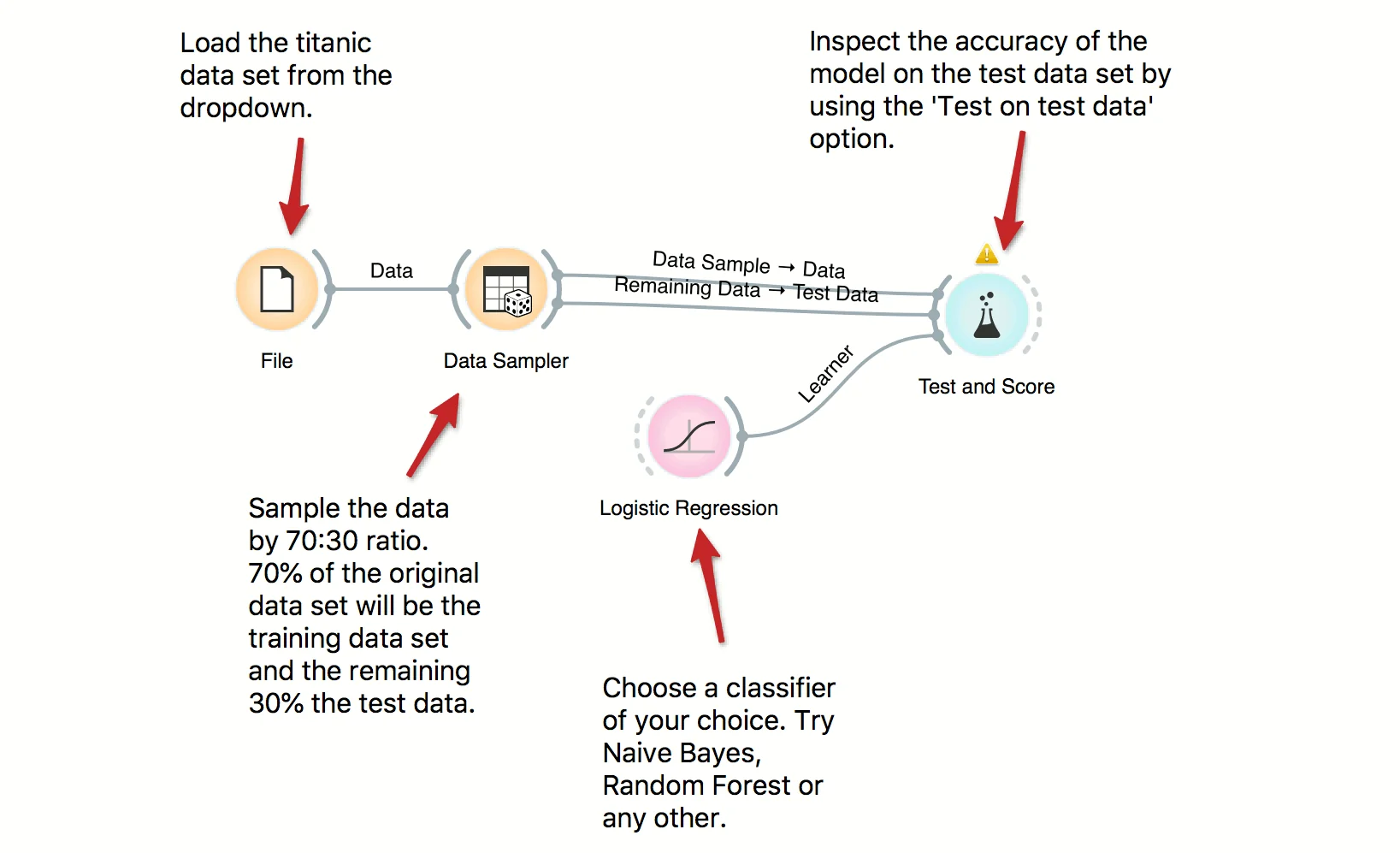
In building predictive models it is important to have a separate train and test data sets in order to avoid overfitting and to properly score the models. Here we use Data Sampler to split the data into training and test data, use training data for building a model and, finally, test on test data. Try several other classifiers to see how the scores change.
Download - Visalization of Data Subsets
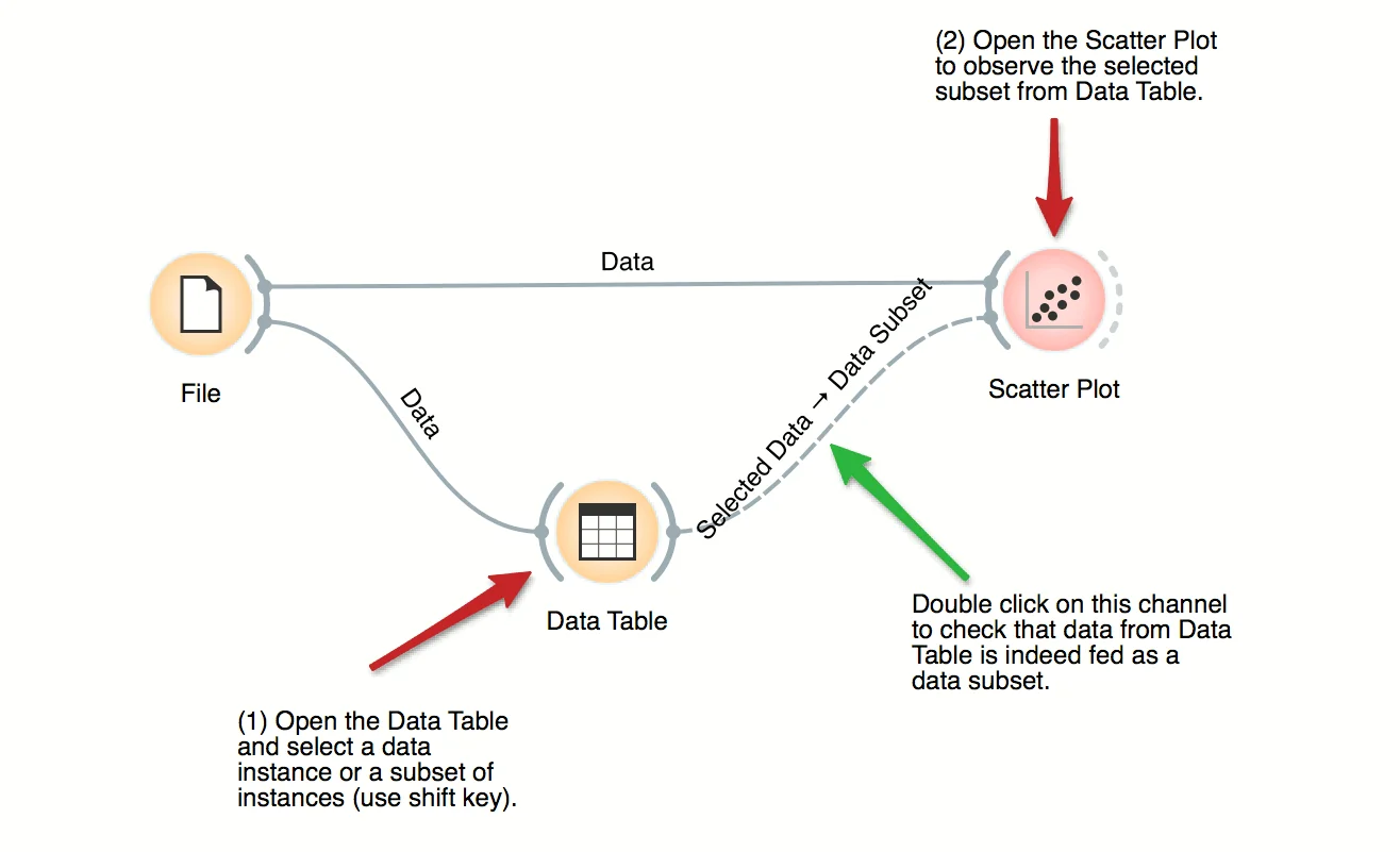
Some visualization widget, like Scatter Plot and several data projection widgets, can expose the data instances in the data subset. In this workflow, Scatter Plot visualizes the data from the input data file, but also marks the data points that have been selected in the Data Table (selected rows).
Download - Explore Subpopulations with Distinct Risk Profiles
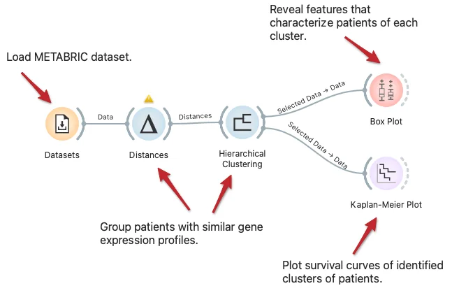
We can visualize the difference in subpopulations of breast cancer patients in the METABRIC dataset through clustering, that is, by identifying groups of data instances similar to each other. We can observe the difference in survival rate between clusters with Kaplan-Meier Plot and explore features that characterize patients of each cluster with the Box Plot widget.
Download - Exploring Survival Features
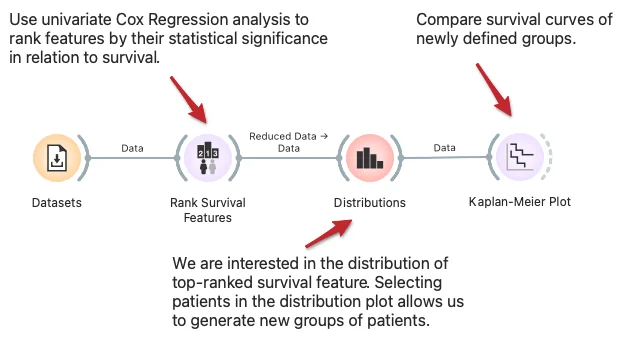
In the workflow, we show how to find and analyze variables related to survival. We start with variables ranked by univariate Cox regression analysis, where we can select the feature of interest. The Distribution widget shows its distribution and allows us to choose interactively a group of patients related to its values. We compare the survival of this group to all other patients in the Kaplan-Meier plot widget.
Download - Feature Ranking
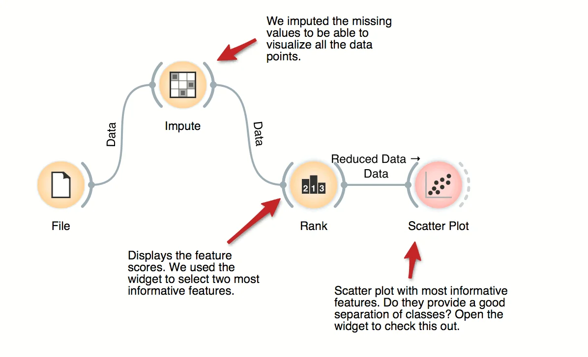
For supervised problems, where data instances are annotated with class labels, we would like to know which are the most informative features. Rank widget provides a table of features and their informativity scores, and supports manual feature selection. In the workflow, we used it to find the best two features (of initial 79 from brown-selected dataset) and display its scatter plot.
Download - File and Data Table
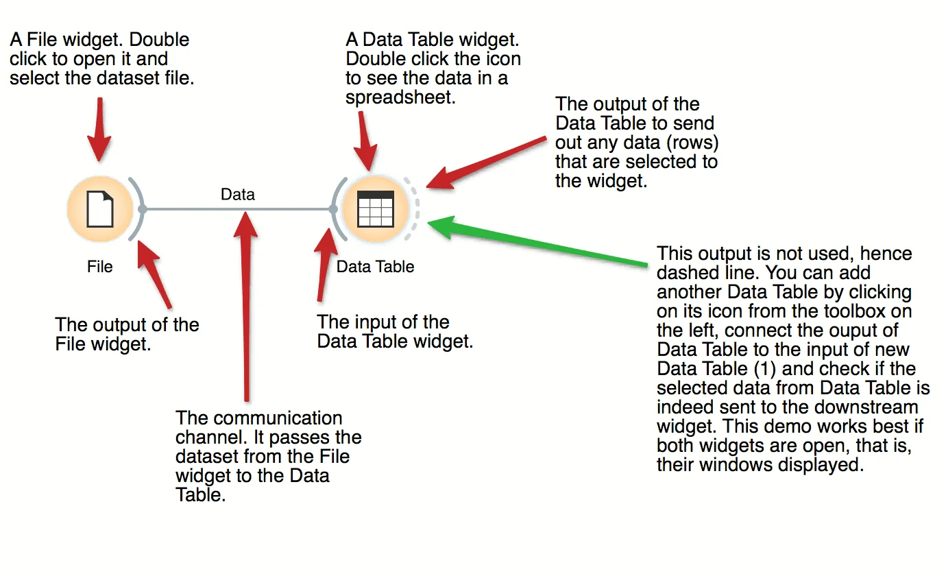
The basic data mining units in Orange are called widgets. In this workflow, the File widget reads the data. File widget communicates this data to Data Table widget that shows the data in a spreadsheet. The output of File is connected to the input of Data Table.
Download - Hierarchical Clustering
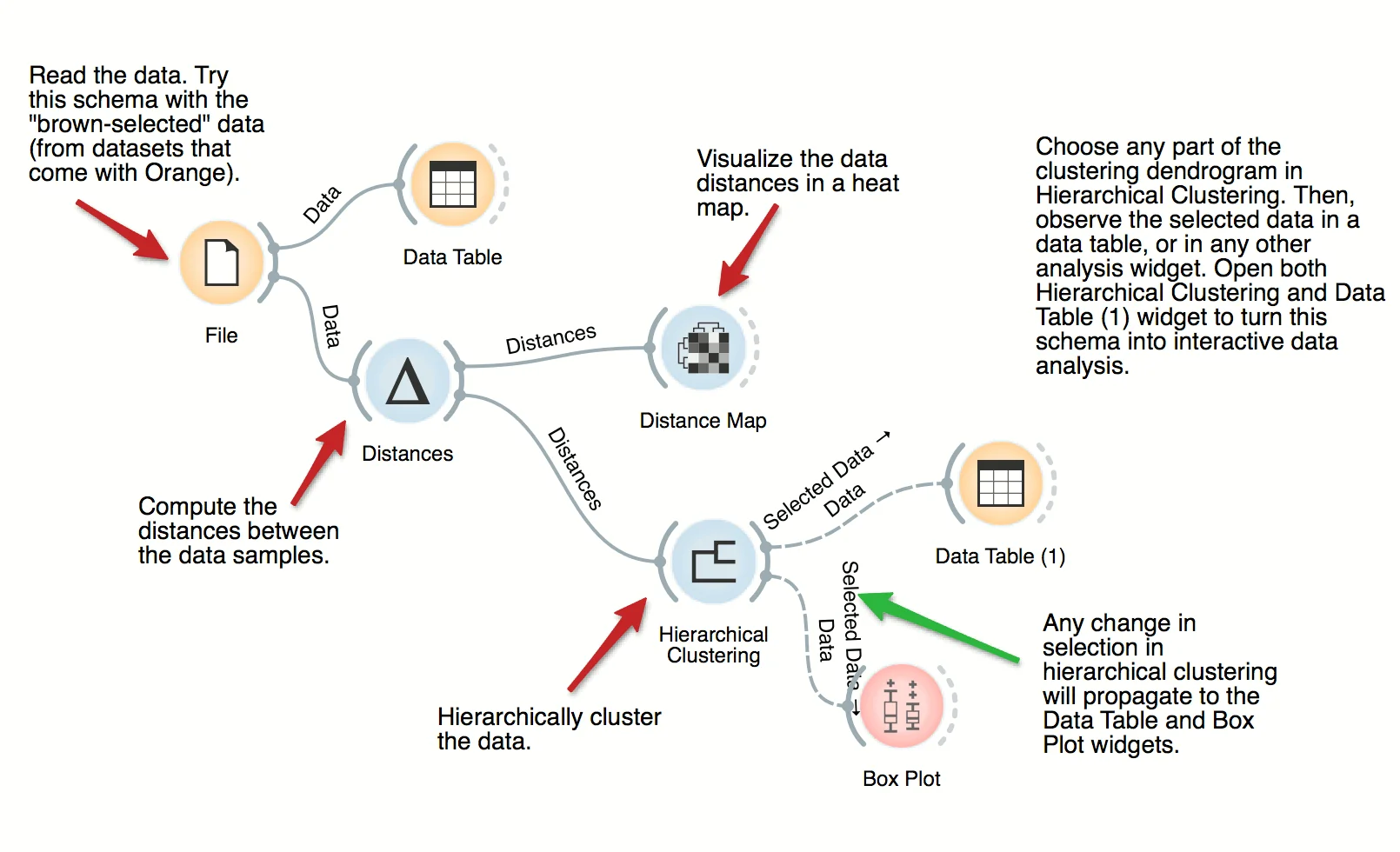
The workflow clusters the data items in iris dataset by first examining the distances between data instances. Distance matrix is passed to Hierarchical Clustering, which renders the dendrogram. Select different parts of the dendrogram to further analyze the corresponding data.
Download - Mental health of tech employees in times of COVID-19
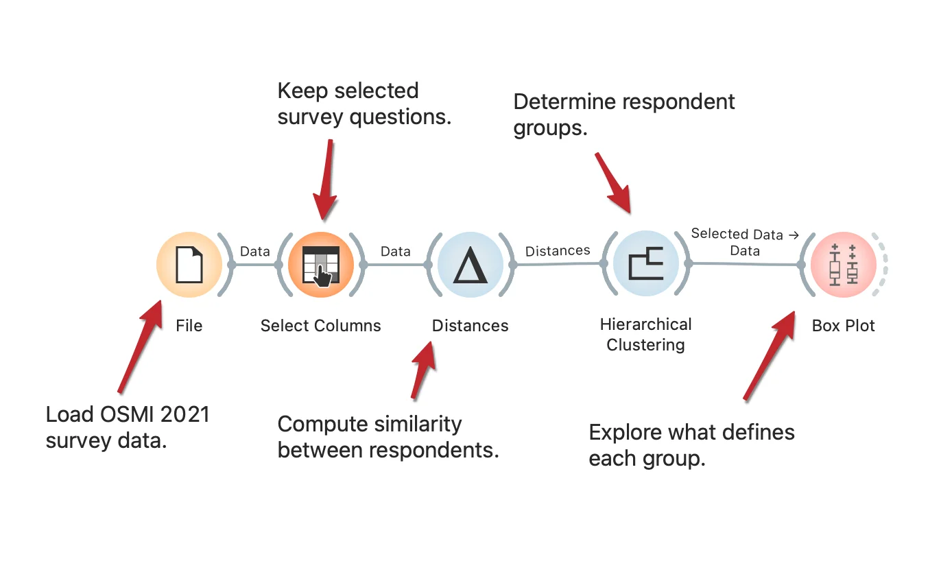
The COVID-19 pandemic brought about many societal changes, including a serious effect on mental health. The Open Sourcing Mental Health 2021 survey measures attitudes towards mental health in the tech workplace and examines the frequency of mental health disorders among tech workers. The workflow presents how to uncover different types of tech employees based on their responses. The procedure is fully described in the SAGE Ocean blog.
Download - Inspecting Outliers with Silhouette
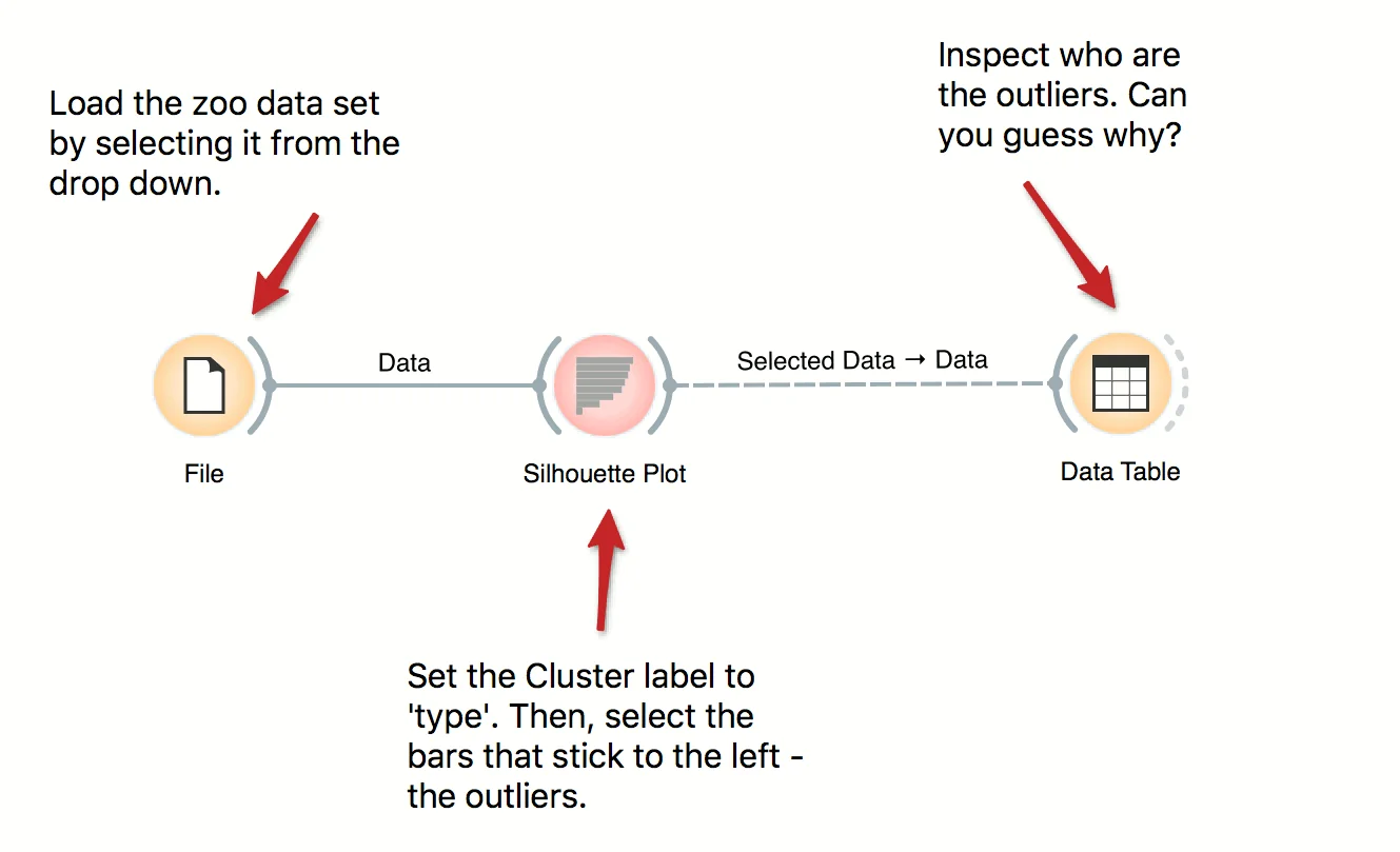
Silhouette Plot shows how 'well-centered' each data instance is with respect to its cluster or class label. In this workflow we use iris' class labels to observe which flowers are typical representatives of their class and which are the outliers. Select instances left of zero in the plot and observe which flowers are these. Try connecting the selection with the Scatter Plot to highlight the outliers.
Download - Pivot Table
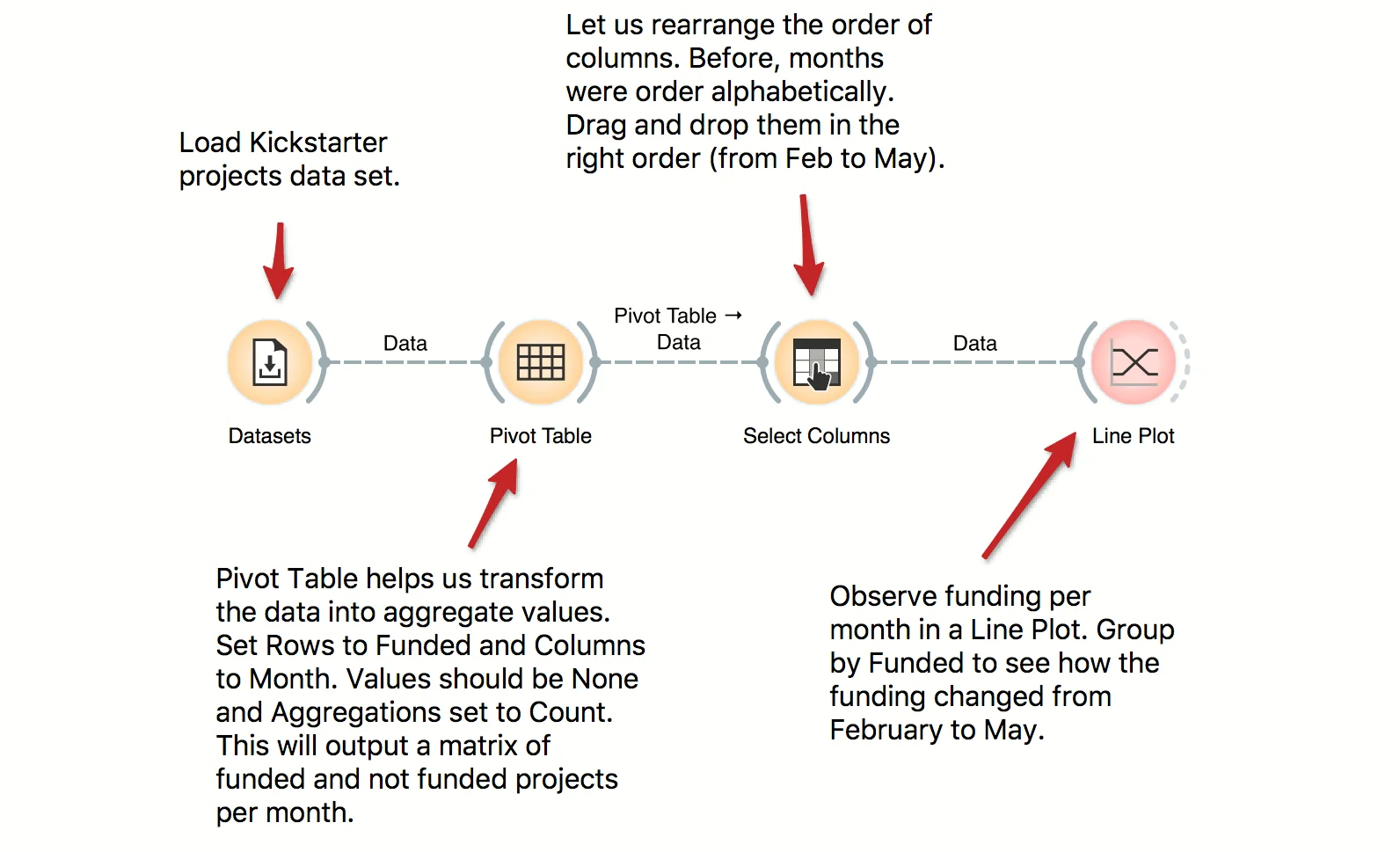
Pivot Table can help us aggregate and transform the data. This workflow takes Kickstarter projects and aggregates them by month. We can inspect the frequency of the published projects per month and observe the difference between funded and non-funded projects. Try constructing several tables with pivot and experiment with different aggregation methods.
Download - Principal Component Analysis
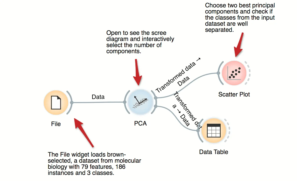
PCA transforms the data into a dataset with uncorrelated variables, also called principal components. PCA widget displays a graph (scree diagram) showing a degree of explained variance by best principal components and allows to interactively set the number of components to be included in the output dataset. In this workflow, we can observe the transformation in the Data Table and in Scatter Plot.
Download - Interactive Visualizations
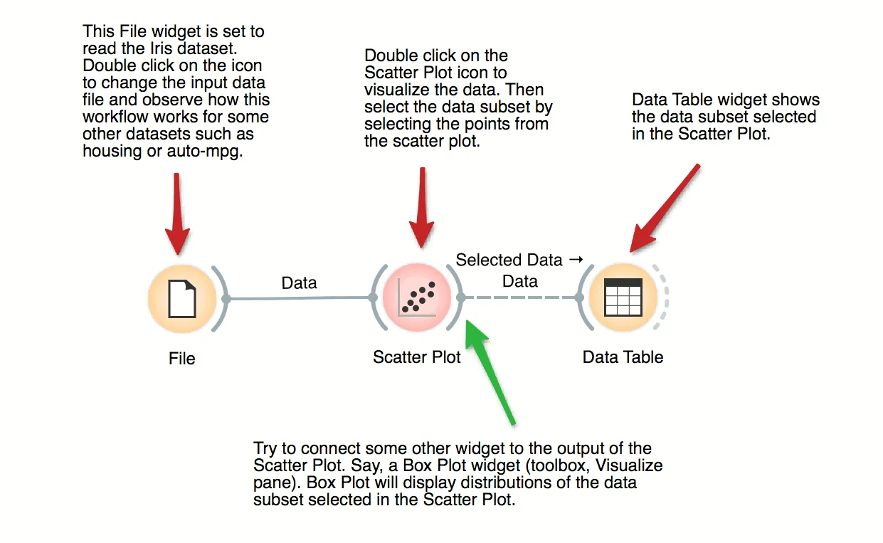
Most visualizations in Orange are interactive. Scatter Plot for example. Double click its icon to open it and click-and-drag to select a few data points from the plot. Selected data will automatically propagate to Data Table. Double click it to check which data was selected. Change selection and observe the change in the Data Table. This works best if both widgets are open.
Download - Story Arcs
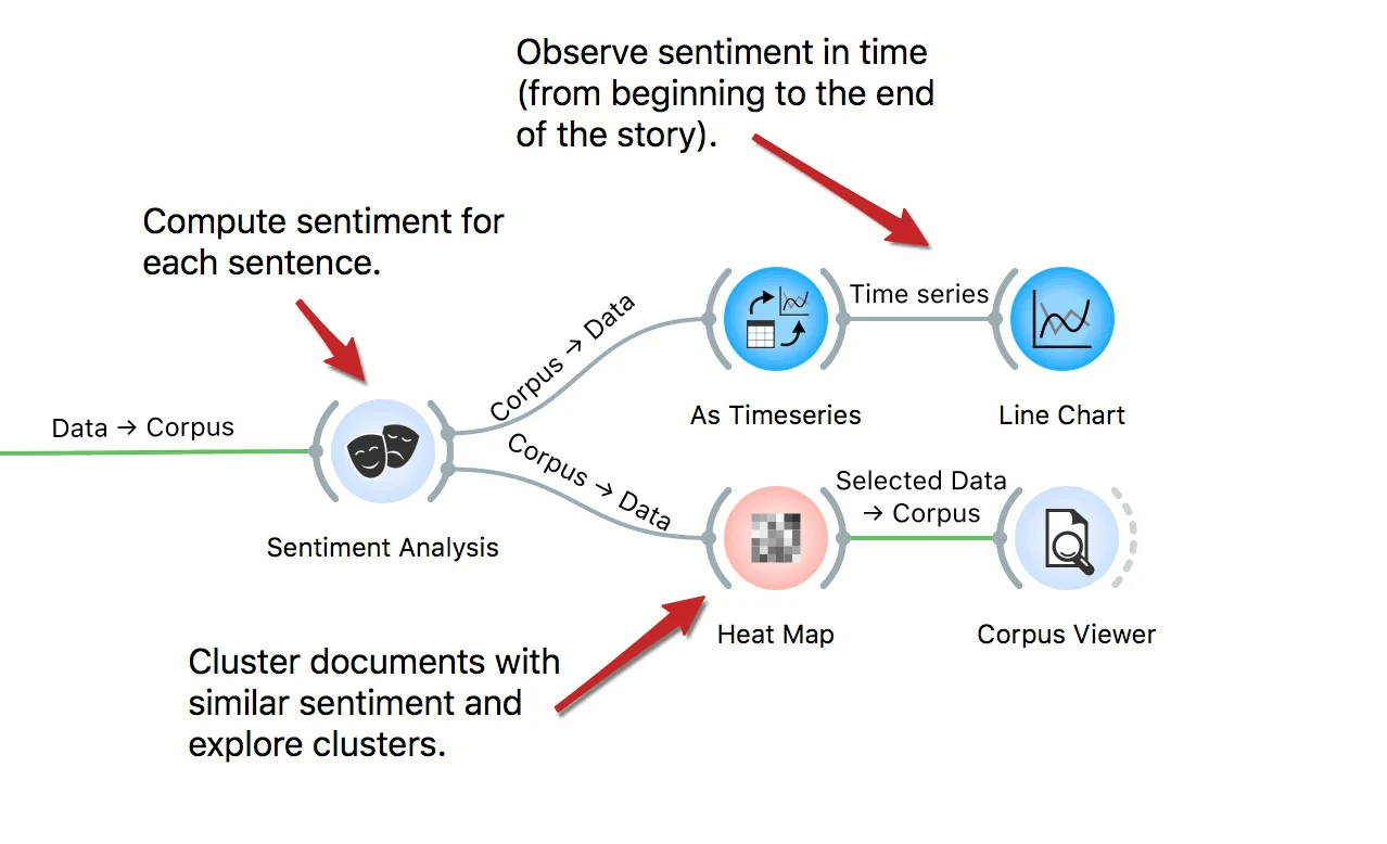
In this workflow we explore story arcs in the Little Match Seller story. First we select the story from the corpus of Andersen tales. Then we create a table, where each sentence of the tale is a separate row. We use sentiment analysis to compute the sentiment of each sentence, then observe the emotional arcs through the story. We also inspect sentences with similar scores in the Heat Map and Corpus Viewer.
Download
title: "Survival Curve Estimation" images: ["/workflow_images/700_survival_curve_estimation.webp"] type: "workflows" blog: "" video: "" download: "700_survival_curve_estimation.ows" workflows: ["Survival Analysis"] weight: 700
One of the primary objectives of survival analysis is to estimate the survival probability from observed survival times of different patients. The workflow plots the Kaplan-Meier approximation of the survival curve for the investigated population in the German breast cancer study group. The Kaplan-Meier plot is interactive; we select the longest-surviving patients and use Box Plot to analyze features that best characterize them.
Download- Document Map Annotation
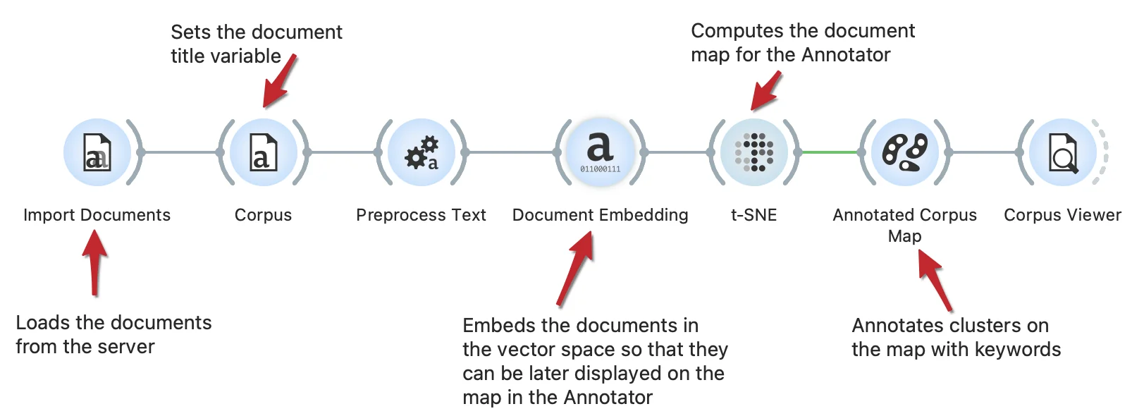
Documents maps can be enhanced with the keywords annotations. This workflow embeds documents in vector space, computes a t-SNE document map and annotates it. The Annotator widget identifies clusters on the map and annotates them with keywords representing a cluster.
Download - Text Classification
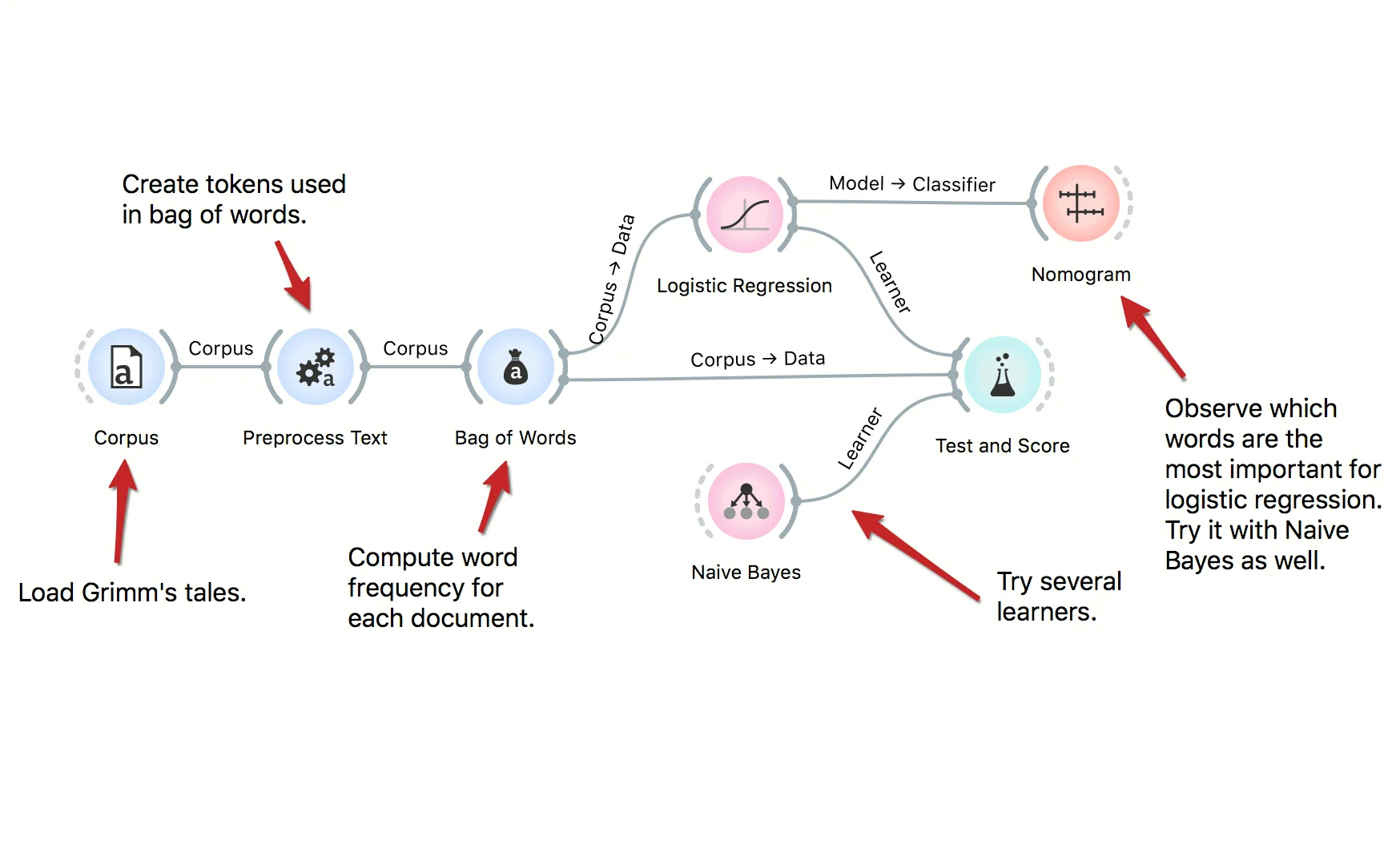
We can use predictive models to classify documents by authorship, their type, sentiment and so on. In this workflow we classify documents by their Aarne-Thompshon-Uther index, that is the defining topic of the tale. We use two simple learners, Logistic Regression and Naive Bayes, both of which can be inspected in the Nomogram.
Download - Text Clustering
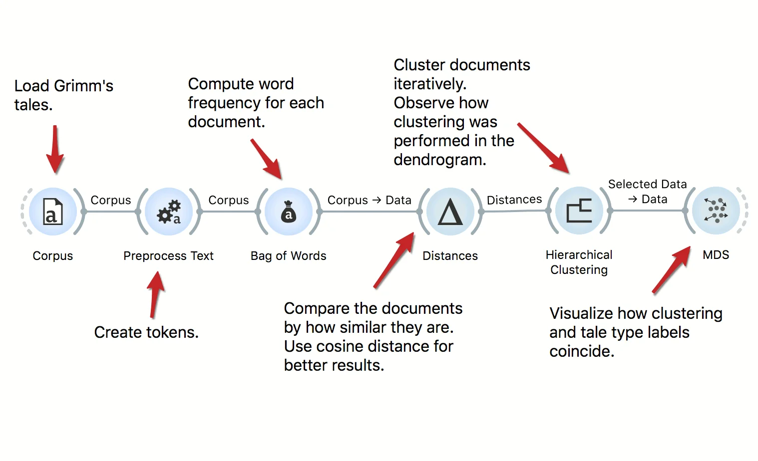
The workflow clusters Grimm's tales corpus. We start by preprocessing the data and constructing the bag of words matrix. Then we compute cosine distances between documents and use Hierarchical Clustering, which displays the dendrogram. We observe how well the type of the tale corresponds to the cluster in the MDS.
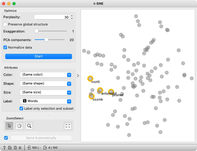
Download - Corpus and Word Maps
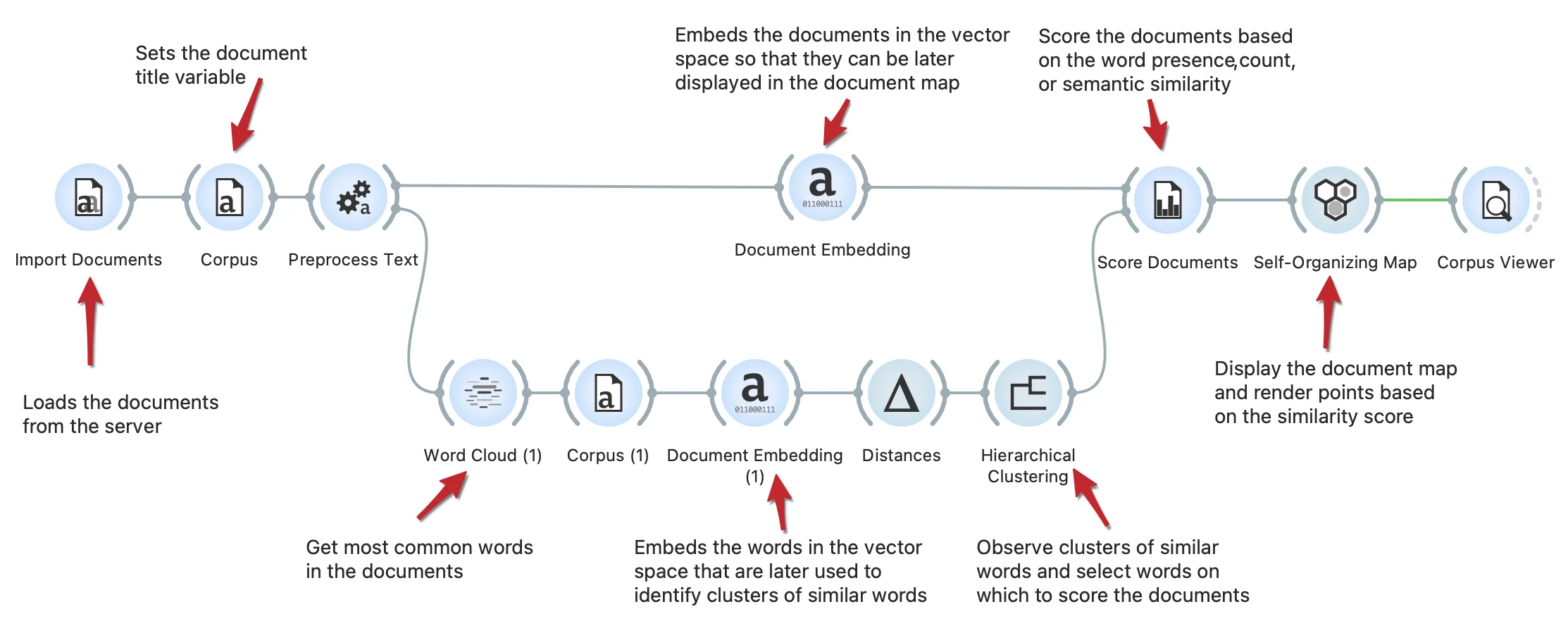
This workflow shows how to extract the most common words from the documents and observe clusters of semantically similar words with Hierarchical Clustering. We select a group of words (connected to the traffic and roads) and use them to score documents according to selection with the Score Documents widget. The scores are visualized in the document map by the Self-Organizing Maps widget.
Download - Keyword-Based Text Document Scoring
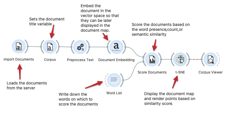
We can score the text documents based on a list of keywords, say, to find the documents which include the keywords or are semantically related to the list of keywords. This workflow shows the Score Documents widget for scoring and the Word List widget to compose a list of keywords. The scores are visualized in the t-SNE document map.
Download - Keyword Extraction from a Set of Text Documents
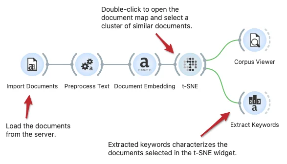
The Extract Keywords widget can characterize a set of textual documents. In this workflow, we load the documents from the server, preprocess them and embed them in the vector space, and display a semantic document map in the t-SNE widget. In this widget, we can select a set of similar documents and then characterize them through keyword extraction. Extract keywords support different inference techniques, including TF-IDF and deep network-based characterization.
Download - Load Text Corpus from the Server Repository
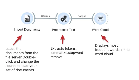
The workflow loads the corpus from the text repository on the server. The repository contains documents with raw text and associated YAML files with meta-features. We here use some pre-processing and then display the most frequent words in a word cloud. This workflow could work on your repository: just change the URL in the Import Documents widget.
Download - Ontology Generation from Keywords
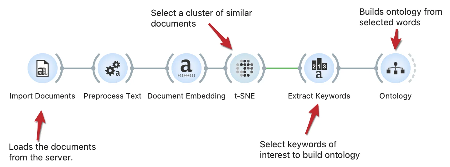
We can automatically build the otology from the set of words. In the workflow, we select a group of documents with similar content. From the selected documents, we extract keywords and generate a new ontology from the subset of keywords with the Ontology widget.
Download - Text Preprocessing
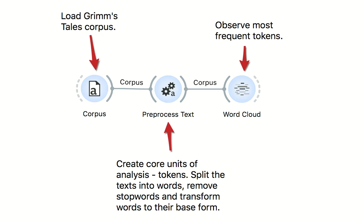
Text mining requires careful preprocessing. Here's a workflow that uses simple preprocessing for creating tokens from documents. First, it applies lowercase, then splits text into words, and finally, it removes frequent stopwords. Preprocessing is language specific, so change the language to the language of texts where required. Results of preprocessing can be observe in a Word Cloud.
Download - Semantic Document Map
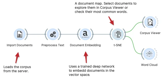
Document maps may reveal clusters of documents with semantically similar content. Here we show a workflow that loads the corpus, performs some text preprocessing and embeds the documents in the vector space using the fastText deep model. The t-SNE widget reveals the document map, where we can select a set of documents and then explore them in Corpus Viewer or characterize them in the display of the most frequent words in the Word Cloud.
Download - Semantic Word Map
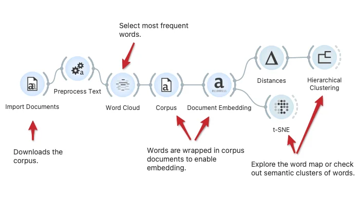
We can find clusters of semantically related words either by hierarchical clustering or t-SNE visualizations. Here, we show a workflow that loads the documents, extracts frequent words, embeds them in a vector space, and explores word clusters.
Download - Classification Tree
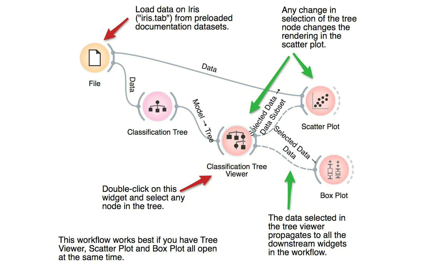
This workflow combines the interface and visualization of classification trees with scatter plot. When both the tree viewer and the scatter plot are open, selection of any node of the tree sends the related data instances to scatter plot. In the workflow, the selected data is treated as a subset of the entire dataset and is highlighted in the scatter plot. With simple combination of widgets we have constructed an interactive classification tree browser.
Download - Twitter Data Analysis
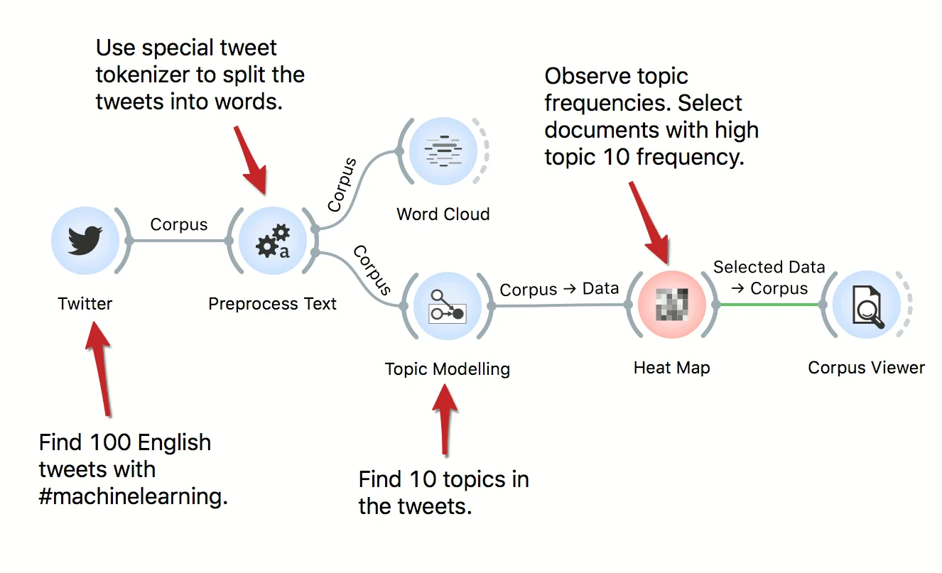
Tweets are a valuable source of information, for social scientists, marketing managers, linguists, economists, and so on. In this workflow we retrieve data from Twitter, preprocess it, and uncover latent topics with topic modeling. We observe the topics in a Heat Map.
Download - Where Are Misclassifications
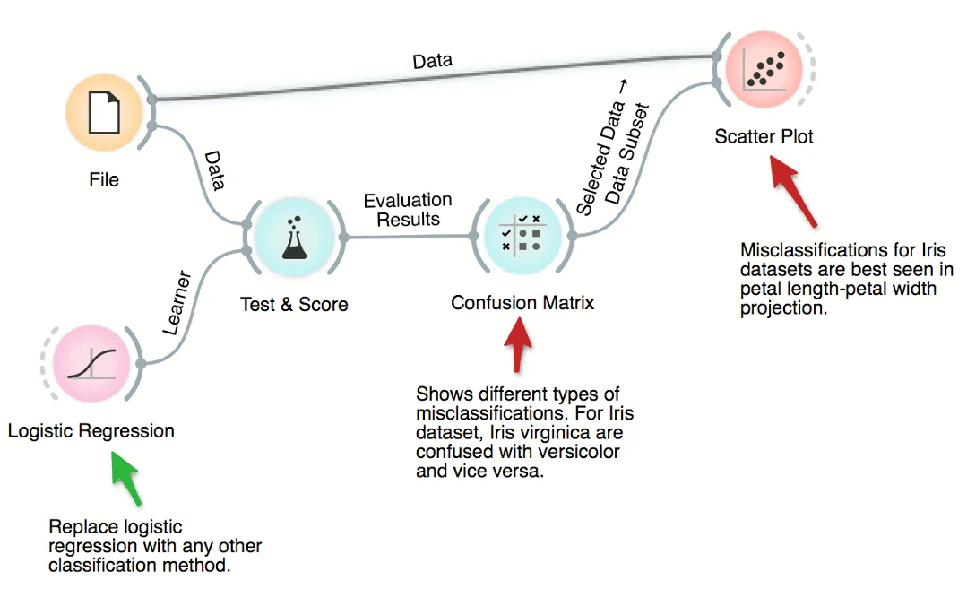
Cross-validation of, say, logistic regression can expose the data instances which were misclassified. There are six such instances for iris dataset and ridge-regularized logistic regression. We can select different types of misclassification in Confusion Matrix and highlight them in the Scatter Plot. No surprise: the misclassified instances are close to the class-bordering regions in the scatter plot projection.
Download